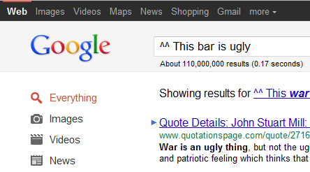
What’s Up With Google’s New Ugly Ass Gray Bar?
What the hell is this shit? What the fuck is this ugly assed gray bar that Google rolled out? Why gray? Since when does Google use gray as a color? That bar used to be offwhite and blue?
I’m sorry, but gray completely clashes with the rest of Google’s image. Sorry guys. WhatasinineUI designer proposed that and second of, who the hell approved it? That’s crazy as hell!
3 Responses
Leave a Reply Cancel reply
You must be logged in to post a comment.
Tags
Android Annoyances Apple Apps Bad Engineering Baseball business Cablevision Chats common sense darwin awards drugs Environment Facebook FiOS Firefox Google Google Chrome Government Grammar Hicks Holiday Idi Internet Explorer Malware Metallica Money MTA net neutrality NYC Philosophy Phones Politics Pride Programs satire Science Song of the week Stupidity Torrents Verizon war Weather WordPress Yankees

Chris says:
I agree. It looks really bad and clashes with the rest of the page.
john says:
It is going to be used as the homebase for the new google plus social application suite. Get with the program….
Portfolioso says:
I know. I’m on google+ already. But it’s not dark gray! It’s very dark for Google’s UI theme.
They’re in the process of redesigning the entire suite of webapps, so they will probably all integrate at some time. Right now, some things are different than others.