Note: If you have the Droid X with Motoblur, or SenseUI, this probably doesn’t apply since your skin already has some of these features. But if you have an original Droid or don’t like Sense or Motoblur, read on:
Everyone needs to download this Launcher Pro immediately. This isn’t an app. It’s a complete homescreen replacement. What does it do? It pretty much gives you up to 7 homescreens, and replaces the bland app drawer slider with the bottom bar from Froyo. I know I first said that anyone who skins Android is an asshole. That’s still true, but this does not count so I’m not a hypocrite. It is based on Froyo (Android 2.2) and doesn’t redo the icons to look dumb (like HTC sense does).
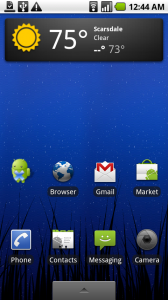
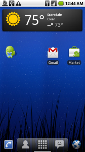
Take a look at the before and after:


The bar on the bottom is called the dock. In Android 2.1 on the Moto Droid, you only get the app drawer slider. Motorola and/or Verizon stripped out the 3D app drawer and the 5 homescreens that made it in the 2.1 update for the Nexus One. In Froyo and in Android 2.2, this is standard. If Motorola/Verizon release Android 2.2 without more homescreens and with the same half assed app drawer, I will be super pissed. So along comes Launcher Pro. Take a look at my before and after screenshots above. The screenshot on the right is better because it neatly packs my phone dialer, contacts, app drawer, messaging and browser on the bottom, so I don’t have to have icons for all of those all over my homescreen. See how much more space I have? That vertical slider thing under the app drawer (the checker square thing) tells you what homescreen I’m on.

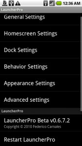
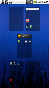
 This homescreen replacement has shitloads of options and you can pretty much customize anything you want. To access options, hit your menu button from the homescreen and click Preferences, which will bring up a settings menu (left screenshot). You can enable the 3D app drawer, change the dock background, lock the background wallpaper from scrolling when you switch screens, add unread message and missed call counts, etc. It also has an expose (that OSX thing where it shows all the homescreens together(see right image). You can backup your homescreens to a settings file on the SD card and restore them on that phone or another device.
So in conclusion, this probably slows down your phone and uses more battery, but it looks mad good, gives you Froyo looking homescreen and shortcuts and if you have the original Droid, you can add up to 7 homescreens. Epic win in my book.
I will absolutely uninstall this if Verizon’s 2.2 update includes multiple homescreens, a dock and the app drawer. But until then, this made my phone so much more convenient.
To get this bad boy running is a little confusing, since it doesn’t run like an app. Once you download it, press your home button on your phone. It will ask you if you want to “complete action using” Home or Launcher Pro. Check “use by default for this action” then click launcher pro. If you don’t it will ask you if you want to use the native home app or the custom Launcher every time. To restore this and get your normal homescreen back, you can clear the default by going to Settings–>Applications–>Manage Applications and clicking on Launcher Pro, then clicking Clear defaults. When you press the home screen again, it will bring up the “complete action using” Home or Launcher Pro option. Check the box and then click Home. OR EASIER – ignore all that babble and just uninstall it.
Download it from the market below (scan it or click the barcode on your phone):

AndroidApps
Android App of the Week: Launcher Pro (I’m actually excited)
July 21, 2010
Computer/ Tech Related
No Comments
Portfolioso
Note: If you have the Droid X with Motoblur, or SenseUI, this probably doesn’t apply since your skin already has some of these features. But if you have an original Droid or don’t like Sense or Motoblur, read on:
Everyone needs to download this Launcher Pro immediately. This isn’t an app. It’s a complete homescreen replacement. What does it do? It pretty much gives you up to 7 homescreens, and replaces the bland app drawer slider with the bottom bar from Froyo. I know I first said that anyone who skins Android is an asshole. That’s still true, but this does not count so I’m not a hypocrite. It is based on Froyo (Android 2.2) and doesn’t redo the icons to look dumb (like HTC sense does).
Take a look at the before and after:
The bar on the bottom is called the dock. In Android 2.1 on the Moto Droid, you only get the app drawer slider. Motorola and/or Verizon stripped out the 3D app drawer and the 5 homescreens that made it in the 2.1 update for the Nexus One. In Froyo and in Android 2.2, this is standard. If Motorola/Verizon release Android 2.2 without more homescreens and with the same half assed app drawer, I will be super pissed. So along comes Launcher Pro. Take a look at my before and after screenshots above. The screenshot on the right is better because it neatly packs my phone dialer, contacts, app drawer, messaging and browser on the bottom, so I don’t have to have icons for all of those all over my homescreen. See how much more space I have? That vertical slider thing under the app drawer (the checker square thing) tells you what homescreen I’m on.
So in conclusion, this probably slows down your phone and uses more battery, but it looks mad good, gives you Froyo looking homescreen and shortcuts and if you have the original Droid, you can add up to 7 homescreens. Epic win in my book.
I will absolutely uninstall this if Verizon’s 2.2 update includes multiple homescreens, a dock and the app drawer. But until then, this made my phone so much more convenient.
To get this bad boy running is a little confusing, since it doesn’t run like an app. Once you download it, press your home button on your phone. It will ask you if you want to “complete action using” Home or Launcher Pro. Check “use by default for this action” then click launcher pro. If you don’t it will ask you if you want to use the native home app or the custom Launcher every time. To restore this and get your normal homescreen back, you can clear the default by going to Settings–>Applications–>Manage Applications and clicking on Launcher Pro, then clicking Clear defaults. When you press the home screen again, it will bring up the “complete action using” Home or Launcher Pro option. Check the box and then click Home. OR EASIER – ignore all that babble and just uninstall it.
Download it from the market below (scan it or click the barcode on your phone):
AndroidApps