Author: Portfolioso


Stop BSing Us, We all Know Steve Jobs is Finished


Face it: The man is in denial and we all fell for it, until yesterday, where he announced he is taking a leave of absence for his health. Quite honestly, everyone is making a big fuss about this and it’s understandable, but it is blatantly obvious that Jobs was completely full of crap. It’s okay though, he just didn’t want to seem weak for the almighty powerful company.

Some bad signs:

  • The man had pancreatic cancer in 2004. I’m sorry, but you just don’t survive pancreatic cancer.
  • He lost weight because of a hormone imbalance? My ass… Stop being in denial
  • Apple withdrew itself from it’s own Macworld Expo and Jobs did not hold the keynote speech.
  • Apple released a vague statement saying something along the lines that it always had a plan for Job’s successor, Jobs is okay, but we just want to throw that out there
  • You ever see a picture of the guy? He is ghastly.
  • Leave of absence? Now it’s just official

So I don’t mean to be negative, and this post is not meant to insult Jobs in anyway. He just wants to keep Apple’s stock up, uhhh…. I mean, he just doesn’t want to share his private health matters with everyone – which is perfectly understandable. Portfolioso.com predicts the man will not live through this current recession. If he does, it’ll be another miracle.

Still No Class for the NY Mets


In my free time of syllabus week (in between old episodes of the Sopranos and other activities), Keith and I spent some time taking a look at new Yankee Stadium and it looks sick. The 2009 inaugural season patch was rolled out today and is very well done.
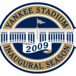
2009 Inaugural Patch vs. Garbage vs. Dominos

As you can see, the Mets patch is bland and is very comparable to Domino’s Pizza. Our online staff at the Mirror can design a better, more sophisticated logo that doesn’t consist of a rounded rectangle, two colors and some plain text. This is an absolute embarrassment. First, they sell out to Citicorp, build a new stadium that looks more like a parking garage, then accept a half-assed, bland logo designed by some blind bailed out accountant at Citi. Honestly now.


Date Fixed


Yeah no one cares, but I fixed my date format on the posts for the main page on my site. Before today, it was shown as “2009-01-11 14:37:49” which is pretty gross. That’s because that’s how it’s stored in the database when I make posts and I just dump it from there to the main page without formatting. I was too lazy to throw some php together to format it properly. But now it’s all set so we can see in plain English when exactly I saw my posts. Wooo. This is what I do instead of useful things. But classes are tomorrow so see ya later.

Edit – So I had a bug where only the first digit of the date was printing. January 10th, or 11th would show up as January 1. That’s all fixed now.

And Boom, There Goes Winter Break


Winter break flew by really quickly. So on my last night home, what am I doing? Enjoying my last night of quality entertainment of FiOS TV on demand and neutral internet before I go back behind China’s Firewall. (if you don’t get my reference, China restricts internet access, so I was making an analogy to my school’s internet vs my neutral FiOS). Also, not that I watch TV at school, but I’m pretty damn spoiled. I go from pure, uncompressed digital with everything on demand to a whopping 40 fuzzy analog channels. Other than that, my break was pretty chill and decent. It was good to come home and get a change of scenery. On the other hand, it’s also good to get back into a routine so I don’t feel like a bum. So that shall be all. I came home in snow and I leave in snow. Woo. Except we never get a lot and I’m greedy. One other thing: I am writing a lot recently. I’m telling you – it’s the new admin interface. beautiful. When you have a good system, you want to use it more. Now lets hope I only write useful, interesting things from now on and not bore out the 3 people who actually read this.

New Google Favicon


So Google changed their favicon again (the little icon you see by the URL in your browser, and if you don’t see it, stop using Internet Explorer 6). This is something I found interesting because their first one was a skinny blue upper case G which was decent. Last year it was changed to a lowercase purple g. This was supposed to be more modern, but got a lot of complaints for not using Google’s colors. So as of this morning when I woke up (and by morning I mean late afternoon) it has been changed yet again. Now it looks like a complete rainbow and is rather odd. At least it uses Google’s colors, but it’ll take some getting used to. Oh it’s the little things on the internet I point out. Have a look-sy (or just go to google):

Google's New Favicon